画像の上に重ねる
たまに見かける、画像の上に重ねる。今日はこれを解説したい。下が完成です。30分もあれば出来ます。
texttexttext
texttexttext
texttexttexttext
HTML
<div class="main-visual">
<div class="m-box">
<div class="m-box__item">
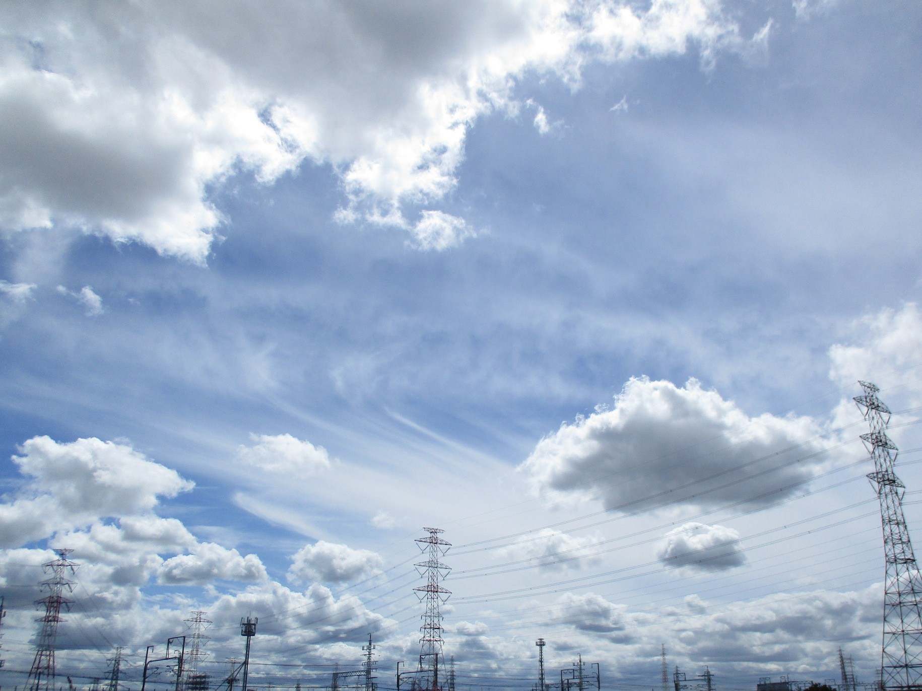
<figure><img src="images/cloud.JPG" alt="画像"></figure>
<p>texttexttext</p>
</div>
<div class="m-box__item">
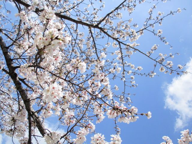
<figure><img src="images/sakura.JPG" alt="画像"></figure>
<p>texttexttext</p>
</div>
<div class="m-box__item">
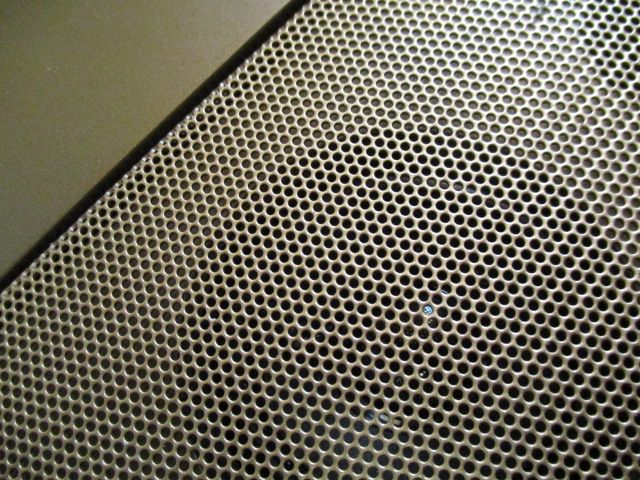
<figure><img src="images/compo.JPG" alt="画像"></figure>
<p>texttexttexttext</p>
</div>
</div>
</div>
main-visualで全体を囲んでいます。その配下にm-boxがあり、さらに、その中にitemがいます。itemの中に、画像と文字がいます。
少しややこしいかもですが、落ち着いて読みましょう。
CSS
.main-visual {
  background-image: url("../images/yama.jpg");
  height: 400px;
  margin-bottom: 10rem;
  background-size: cover;
  position: relative;
}
.main-visual .m-box {
  position: absolute;
  top: 330px;
  padding: 1rem;
  display: flex;
  justify-content: space-between;
  gap: 10px;
}
.main-visual .m-box__item {
  width: calc(33.3333333333% - 10px);
  background: #fff;
  border: 1px solid #f3f3f3;
  padding: 1rem;
}
main-visualに背景を指定します。あとは、heightで高さをして、position: relativeを書きます。ここを起点にします。
margin-bottom: 10remで下に余白を作ります。後続する要素がかぶるので、書いています。
そのあとm-boxにposition: absolute;を書き、topで位置を決めます。これは任意です。デザインに応じて、調整しましょう。
そのあと、flexにして、画像を横並び。itemのwidthを決めます。calcが便利です。
SCSS
.main-visual{
background-image: url("../images/yama.jpg");
height: 400px;
margin-bottom: 10rem;
background-size: cover;
position: relative;
.m-box{
position: absolute;
top: 330px;
padding: 1rem;
display: flex;
justify-content: space-between;
gap: 10px;
&__item{
width: calc(100% / 3 - 10px);
background: #fff;
border: 1px solid #f3f3f3;
padding: 1rem;
}
}
}
SCSSの方が単純ですね。これを機に、SCSSを知らない人は勉強を始めて下さい。
さいごに
今回は画像の上に重ねるHTMLとCSSを紹介しました。たまに見かけるので、是非、挑戦して下さい。楽しいですよ。